|
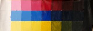
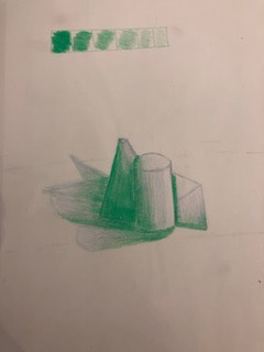
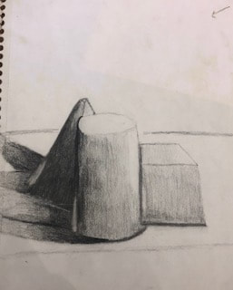
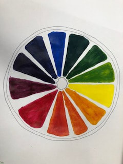
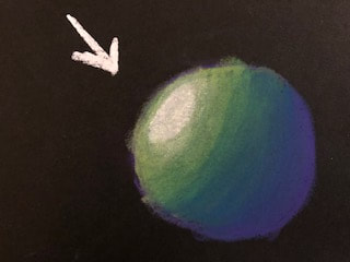
Above and to the left is my value chart and my color wheel. The value chart consists of the top being the tints, where white is added to each color, and the bottom is my shades, where black is added to each color. To the left is my creative color wheel. I chose to do an orange and show my colors through that.
|
|
|
|
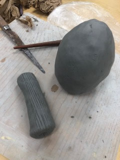
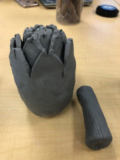
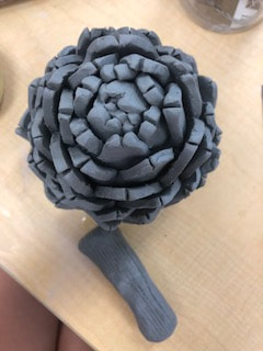
- I find my craftsmanship of my artichoke to be very well done and pleasing. I feel that the proportions of my piece were done well and it actually looks realistic. I made my piece look neat and gave it texture to make it look real.
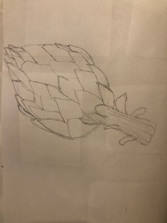
- The most difficult part of the project to me was getting my leaves to look realistic. I wasn't sure what size to make them and struggled to find the right shape. Eventually I made a template that I liked and then just continued to make the template paper larger and larger until I finished the leaves.
- I think my sculpture is pleasant from all views especially because it doesn't have a flat side to it. It's very symmetrical making the piece look neater and more put together.
- The differences in making a sculpture and a 2D piece is drastic. A sculpture has to be planned out a lot and has height, width, and depth; whereas 2D pieces only have height and width. Sculptures are made to look more identical to real life objects in my opinion; whereas it's clear that a painting or a 2D piece is just a painting portraying an object. If done really well 3D objects may be impossible to tell from the actual object.
- I created textures in my artichoke by using the clay carving tools. I used the sharp metal tool for the stem of my artichoke to portray the rough and indented stem. For the base of my artichoke I used my hands as well as the wooden rib tool to make it smooth and easier to apply the leaves. I used the knife to cut each leaf of the artichoke. After I finished my artichoke I used the smaller wooden tool to try and smooth over the leaves creating a sleek and realistic look.
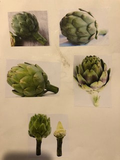
- I believe my artichoke really does look realistic. I achieved this by studying and working off of photos of different artichokes. I also looked more closely at each part involved in an artichoke, such as the stem and how detailed it needed to be. Then I also did research to figure out how to shape my leaves as well as the sizing of those.
- If I were to do this project again the one thing I would do better is smoothing out my leaves before applying them. I did this somewhat but not well enough because after I'd finished everything I had to go back and try and rewet and re-smoothe out the whole artichoke which was tedious and difficult to manage.
|
|
|
|
|
- Describethe craftsmanship of your prints. (How good the project is technically crafted)
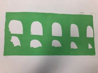
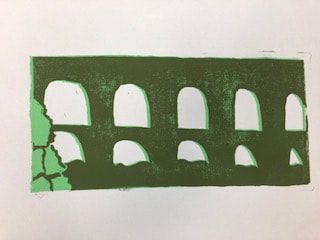
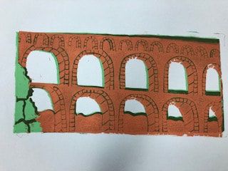
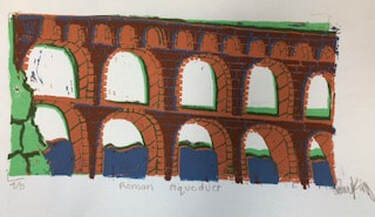
- I believe that my ink coverage and placement of my prink could've been better. You can for sure still tell what my object is meant to be but I found it really hard to line up my print accurately each time.
2. Texture, Color Harmony, and Balance:
-texture
I think that my texture looks pretty good. It's kinda hard to achieve texture by using prints but with doing the lines in the brick I think that helped my piece to look more realistic.
-color harmony
I used mostly neutral colors and nothing too crazy on my aqueducts. I used blue for the water, which seemed to be an obvious choice. I used brown for the actual aqueducts to keep it plain and simple, and then I used green for the bushes because bushes are usually green.
-balance
I think that my balance is pretty good on my piece. I used up the whole space with very little negative space creating a piece pleasing to the eye. I believe that again cutting out the smaller openings in the top could've helped and created a little bit better composition, one with more negative space but besides that I feel pretty good about my composition.
3. What could you do differently?
To enhance my outcome for next time I would pay closer attention when lining up the prints. I also would've done a darker green on the inner bush part because my green doesn't look all that realistic. Lastly, I would cut out the smaller openings on the top part of the aqueducts.
|
|
|
|
|
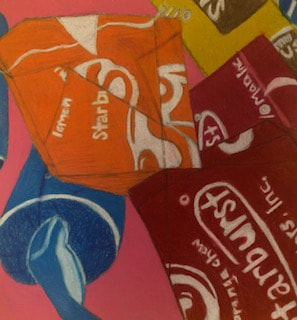
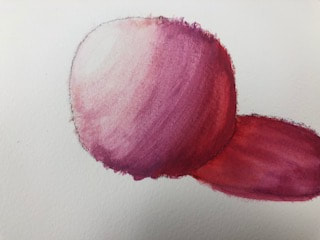
To the left is my colored pencil still life candy practice. I think that this practice helped me to get used to using colored pencils and helped my final to be better.
|
|
|
|
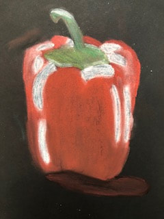
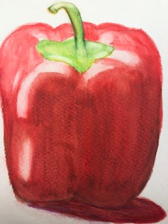
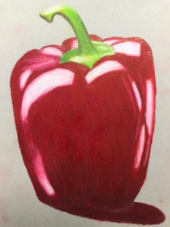
Below are my practice drawings starting with watercolor, then prisma colors, then colored pencil. I like the colored pencil medium best because I feel like it looks the most neat and is my best practice drawing. Above is my three drawings of a red pepper using the same three mediums. Again I liked using the colored pencil medium best for I feel like that drawing looked the best and was the most neat and well blended and looked most like the original pepper picture I was looking at.
|
|
|
|
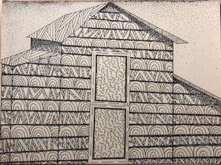
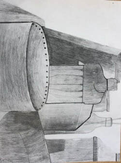
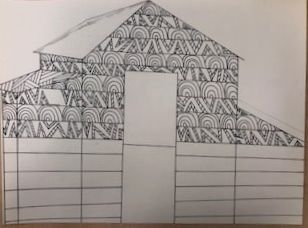
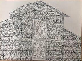
1. I arranged my composition in a way that would fill the whole page but not seem like too much was going on. I used stippling in my piece to fade and show the background but I also used it to show shadows and to give the allusion that each would piece was sticking out. I found my composition to be very successful.
4. As far as craftsmanship goes I believe I did a pretty good job using different pen techniques and having different values involved in my piece. I think that adding the background stippling and having it go from a dark top and fading it out allowed for a neat and clean background that is still there but doesn't put too much focus on the back of my piece. I did darker pen techniques in my foreground (barn) to really make it stick out and be the center of attention. Then with the doors of the barn I went back to a lighter pattern so that the whole barn wouldn't just blend together.
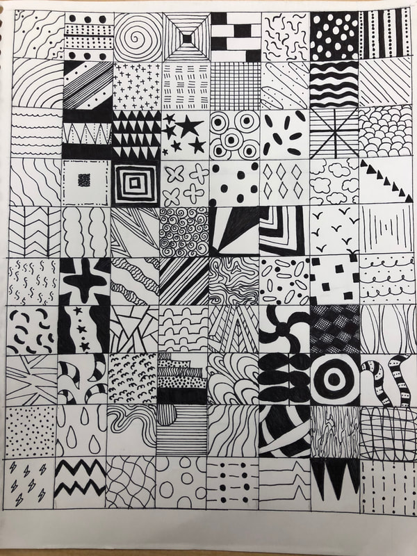
5. Doing the 100 squares of pattern in my sketchbook really helped me with this project. This made for easy options and choices when thinking about what patterns I wanted to use in my piece. Also doing the video practice of drawing different patterns on a log really helped me in doing some patterns lighter and some darker in order to make it look nice. Overall doing lots of practice before actually starting my final project helped me learn more about how to use my pen and about techniques that would work best for me.
6. When applying pen and ink techniques it's important to understand the concepts taught in class because if not my piece may have looked sloppy. Also, I wouldn't have added the stippling in the background or nearly as much value as I did after watching videos and listening in class. I think also there's a certain way and technique in picking patterns that work with you're piece and I would not have picked the best patterns if I had not paid attention in class.
7. As a growing artist I feel like doing this project has made me a lot more confident in my pen and ink skills. Before, pen and ink kinda scared me because I was always afraid I would mess up and not be able to change it easily; but once I started the final I had also drawn in pencil lightly underneath to help guide me and avoid mistakes. I also feel like I now know lots of patterns off the top of my head that would help me in later pen and ink projects.
8. If I could recreate my piece I probably would add even more value in with my stippling. I also would've done more of a light and dark pattern switching off between wood slots, for mine kind of look too similar to one another.
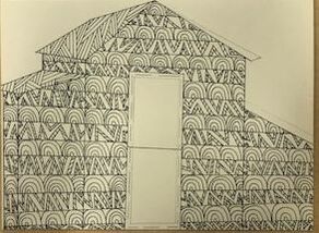
- 2. Texture and pattern are important in my composition to show the wood in my barn. Patterns are used to give a little more life to the barn and make it different than just any ordinary barn. I used a crossed like pattern on the roof because in my reference picture you can see it is tin but I wanted it to pop more than just a plain tin roof.
4. As far as craftsmanship goes I believe I did a pretty good job using different pen techniques and having different values involved in my piece. I think that adding the background stippling and having it go from a dark top and fading it out allowed for a neat and clean background that is still there but doesn't put too much focus on the back of my piece. I did darker pen techniques in my foreground (barn) to really make it stick out and be the center of attention. Then with the doors of the barn I went back to a lighter pattern so that the whole barn wouldn't just blend together.
5. Doing the 100 squares of pattern in my sketchbook really helped me with this project. This made for easy options and choices when thinking about what patterns I wanted to use in my piece. Also doing the video practice of drawing different patterns on a log really helped me in doing some patterns lighter and some darker in order to make it look nice. Overall doing lots of practice before actually starting my final project helped me learn more about how to use my pen and about techniques that would work best for me.
6. When applying pen and ink techniques it's important to understand the concepts taught in class because if not my piece may have looked sloppy. Also, I wouldn't have added the stippling in the background or nearly as much value as I did after watching videos and listening in class. I think also there's a certain way and technique in picking patterns that work with you're piece and I would not have picked the best patterns if I had not paid attention in class.
7. As a growing artist I feel like doing this project has made me a lot more confident in my pen and ink skills. Before, pen and ink kinda scared me because I was always afraid I would mess up and not be able to change it easily; but once I started the final I had also drawn in pencil lightly underneath to help guide me and avoid mistakes. I also feel like I now know lots of patterns off the top of my head that would help me in later pen and ink projects.
8. If I could recreate my piece I probably would add even more value in with my stippling. I also would've done more of a light and dark pattern switching off between wood slots, for mine kind of look too similar to one another.
|
|
|
|
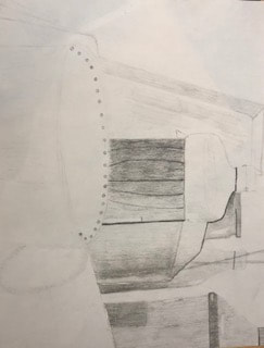
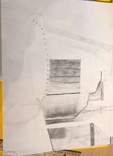
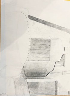
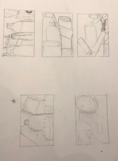
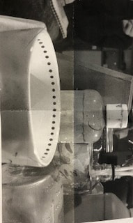
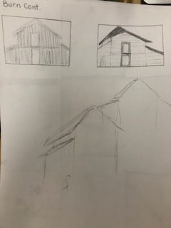
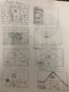
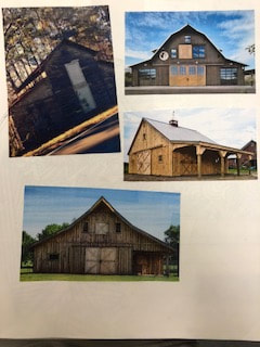
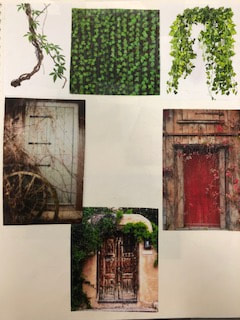
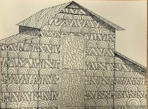
Above are my composition sketches of a barn outside my neighborhood (which I chose) and a rustic doors, also there is my reference pictures which helped me in choosing how to form my final piece. Along with those are four in progress pictures of my pen and ink drawing of a barn. I used several different patterns to add texture and shading into my piece. As seen in the fourth picture I began using stippling to make each piece of wood stick out and to show shadows.
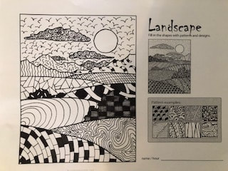
On this sheet we used different patterns in a landscape. This helped me in seeing difference between foreground and backgrounds. I like how my sky and clouds turned out. I don't like how dark I made the bush right up next to the hill behind it, the kind of seem to blend together which I could've done better.
|
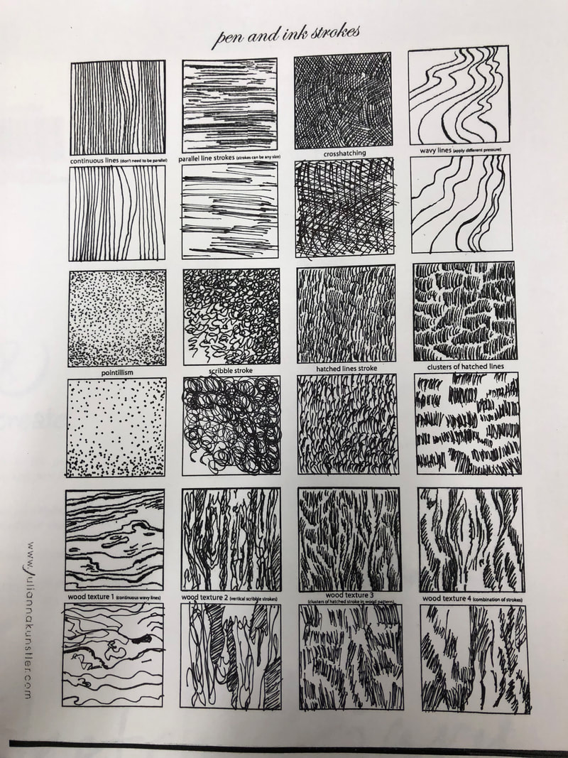
These worksheets allowed me to try using different textures and techniques with the pen. I had to sometimes use lighter pressure and sometimes darker to create different values with the pen. Since I've never really tried doing different textures with pen before this worksheet helped in showing me and teaching me to do so.
|
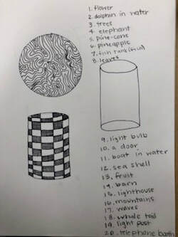
Here is my two shapes wrapped in patterns. On the sphere I used a wave type pattern to give an allusion that it is spinning in a way. In the second image, the cylinder, I used a checkered type pattern to show a darker pattern that I may use in my final project.
|
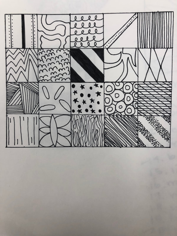
These are my 100 pattern squares. I tried different patterns to test which might look best for my final project. I used lights and darks to have ideas for my foreground and background. I think most most of my patterns worked pretty well and I especially like my very last one, even though it is very simple. I also like the wavy line ones and it will help with curves I may have on my final project.
|
|
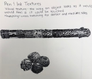
To the left is my pen and ink texture practice. My log texture and balls of texture are both from the videos we watched in class.
|